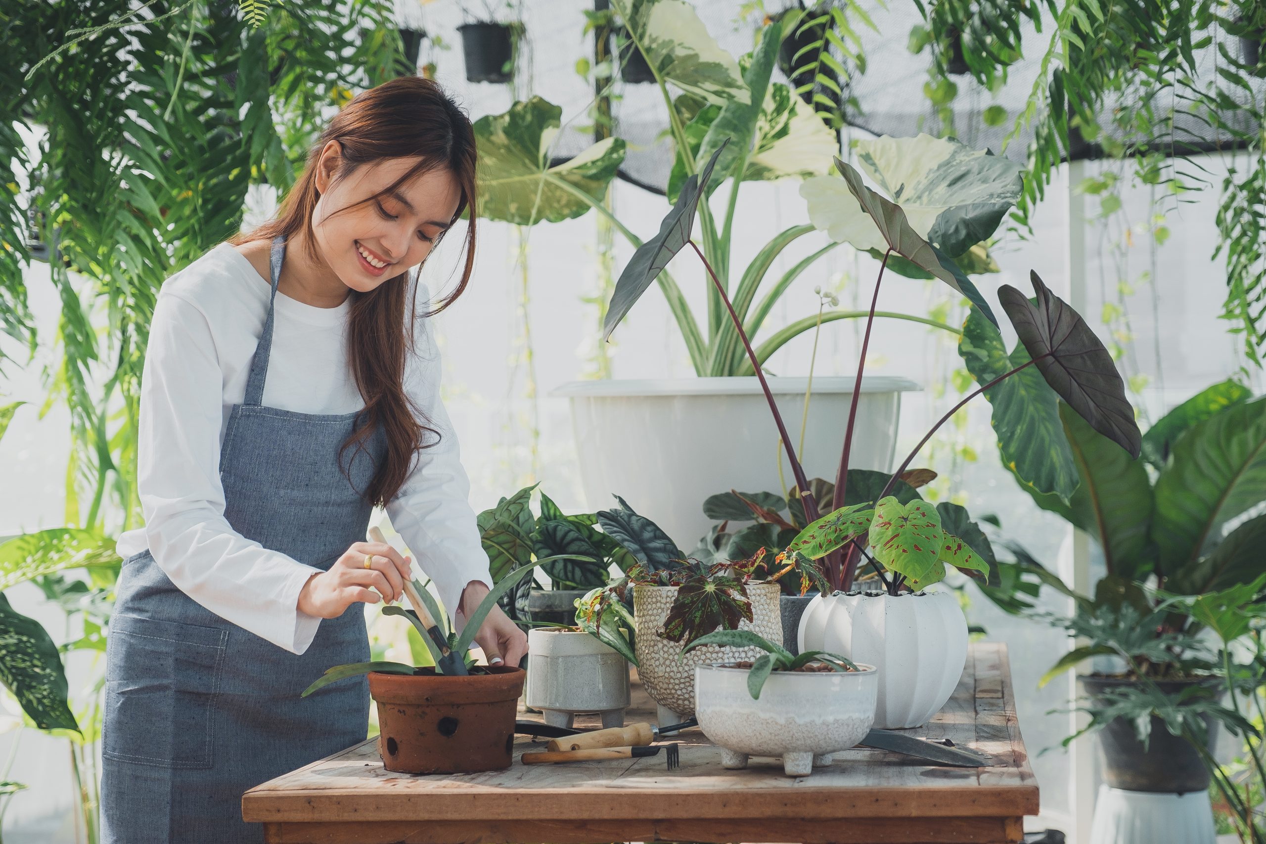
Colors play a crucial role in interior design as they have the power to evoke emotions and set the mood of a space. Understanding the different aspects and effects of colors is essential when designing your home. From warm and cool tones to complementary and neutral shades, each color choice can greatly impact the overall aesthetic and ambiance of a room. Choosing the right color palette can create a harmonious and visually pleasing environment, while the wrong color combinations can clash and disrupt the desired atmosphere. Furthermore, colors can also be used strategically to highlight or downplay certain elements in a space, creating depth and visual interest. By considering factors such as natural light, personal preferences, and the psychology of color, you can make informed decisions when selecting colors for your home’s interior design. Whether it’s creating a calming retreat or a vibrant and energetic space, the choice of colors is a crucial step in any design project.
The Psychology of Color
The psychology of color is an important consideration when designing your home, as it can have a significant impact on human behavior and emotions. Different colors have the power to evoke specific moods, influence cognitive functions, and even affect productivity and creativity.
For instance, warm colors such as red, orange, and yellow are known to create a sense of energy and excitement. These colors can stimulate the mind and promote activity, making them ideal for areas like the kitchen or home office where productivity is important. Alternatively, cool colors like blue and green have a calming effect and can help to create a soothing and relaxing atmosphere. These colors are often used in bedrooms and living spaces where relaxation and tranquility are desired.
Colors can also evoke specific emotions or representations. For example, blue is often associated with feelings of serenity and trust, while red can evoke passion and excitement. Green is commonly linked to nature and is known for its calming and refreshing qualities.
By carefully selecting the colors for your space, you can create a specific ambiance or set the tone for different rooms in your home. Whether you want to create a cozy and inviting atmosphere or foster an environment that promotes focus and productivity, the psychology of color offers valuable insights into the effects of color on human behavior and emotions.
Color Choice for Your Home
When it comes to designing your home, color choice plays a crucial role in creating the desired atmosphere and setting the right mood. The colors you select can impact how you feel in a space, as well as influence your productivity, relaxation, and overall well-being. By understanding the psychology of color and considering factors such as natural light, color schemes, and the effects of different hues, you can make informed choices that enhance your living environment and reflect your style. Whether you opt for warm colors to boost energy and productivity or cool tones for a calming and serene atmosphere, the right color palette can truly transform your home into a space that feels just right. So let’s delve deeper into the importance of color choice and how it can positively impact your design projects.
We talk about the colors Primary, Secondary, and Tertiary.
When it comes to designing your home, understanding the importance of colors is crucial. Colors play a significant role in setting the mood, enhancing aesthetics, and creating a harmonious atmosphere. In design, we categorize colors into three main groups: primary, secondary, and tertiary colors.
Primary colors are the base colors from which all other colors are created. They consist of red, blue, and yellow. These colors cannot be mixed or created by combining other colors. Instead, they serve as the foundation for the entire color spectrum.
Secondary colors are the result of mixing two primary colors. They include green, orange, and purple. For instance, mixing blue and yellow creates green, red and yellow create orange, and blue and red create purple. Secondary colors are vibrant and add energy to the overall design.
Tertiary colors are formed by mixing a primary color with a secondary color. They are a combination of adjacent primary and secondary colors on the color wheel. Examples of tertiary colors are blue-green, yellow-orange, and red-purple. These colors provide more depth and variety to a design.
Understanding the concept of primary, secondary, and tertiary colors allows you to have greater control over your color choices. Mixing colors to create new shades and hues allows you to personalize your design and create something unique. So, whether you’re choosing a color palette or deciding on the perfect accent color, color theory is an essential tool to have in your design repertoire.
Neutral Colors
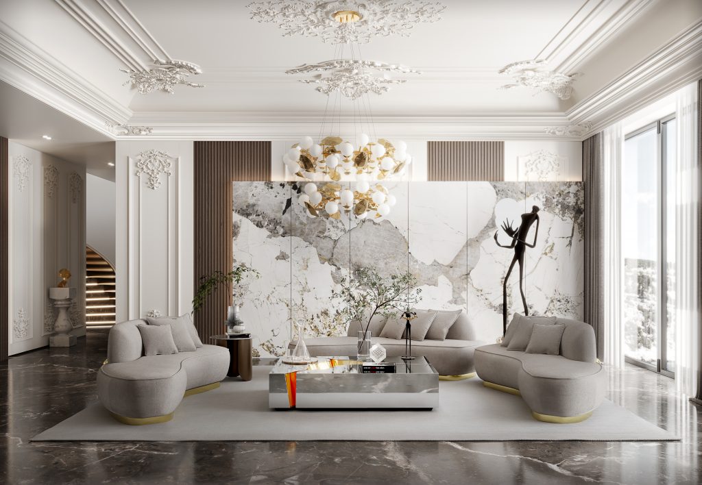
Neutral colors play a vital role in interior design by providing a versatile and balanced foundation for any space. These colors, including shades of white, beige, gray, and taupe, are often referred to as “grounding” colors. They have the unique ability to blend seamlessly with other colors, making them the perfect backdrop for any design style.
Neutral colors create a calm and soothing environment, making them ideal for larger areas such as walls and floors. They can also serve as a canvas for adding pops of color through accent pieces like throw pillows, artwork, or curtains. By incorporating neutral colors in a design, you can easily change the overall look and feel of a room without needing to completely redecorate.
Another advantage of neutral colors is their ability to create a range of tones within a space. By adding white or black to a neutral base, you can create lighter or darker versions of the color, respectively. This allows for a subtle play of light and shadow, adding depth and interest to the design.
Some popular neutral colors commonly used in home decor include beige, ivory, taupe, and various shades of gray. These colors are timeless and provide a clean and sophisticated look to any room.
Popular Colors
When it comes to designing your home, the choice of colors plays a vital role in creating the desired atmosphere and feel. Popular colors are often chosen for their positive emotions and associations. Let’s explore the impact these colors have on your space.
1. Blue: This serene color is known for its calming effect. It evokes feelings of relaxation and tranquility, making it an excellent choice for bedrooms or spaces where you want to unwind and destress.
2. Green: Symbolizing nature and growth, green brings a sense of freshness and harmony to a room. It can create a soothing ambiance, especially when used in spaces like living rooms or home offices.
3. Gray: This versatile and neutral color is highly popular in interior design. It adds sophistication and elegance to any space, making it suitable for both modern and traditional styles. Gray also acts as a calming backdrop, allowing other elements to shine.
4. Beige: A timeless and classic hue, beige exudes warmth and provides a sense of coziness to any room. It works well as a base color, allowing you to introduce various accent pieces and experiment with different styles.
5. Yellow: Known as the “happy color,” yellow brings warmth and optimism to a space. It can create a cheerful and energetic atmosphere, making it a great choice for kitchens, dining rooms, or any area where you want to encourage positivity and creativity.
By understanding the impact of popular colors, you can choose the ones that align with your desired atmosphere and feel when designing your home. Whether you opt for calming blues or vibrant yellows, these colors have the power to transform your space into a haven of comfort and style.
Darker and Lighter Colors
When designing your home, the concept of darker and lighter colors plays a crucial role in creating the desired ambiance and atmosphere. Understanding how these colors affect a room can help you achieve the desired aesthetic and mood.
Darker colors, such as navy blue and charcoal gray, can add depth and intimacy to a room. These rich hues absorb light, making the space feel cozy and comforting. They are often used in bedrooms or areas where you want to create a sense of relaxation and serenity. Darker colors can also make a room feel more intimate, perfect for creating a cozy reading nook or a warm and inviting living room.
On the other hand, lighter colors, like pastel pink and soft beige, have the power to make a space feel more open and spacious. These colors reflect light, creating an illusion of more square footage. Lighter colors are commonly used in smaller rooms or areas where you want to maximize the sense of openness and airiness, such as bathrooms or kitchens. They can give the impression of a larger space and brighten up even the darkest of rooms.
Whether you decide to go for darker or lighter colors in your home, it’s important to consider the atmosphere you want to create. Darker colors can provide depth and intimacy, while lighter colors can make a space feel open and spacious. Experimenting with different shades and tones within the darker and lighter color palettes can give your home a unique and personalized touch.
Bright and Calming Colors
When it comes to home design, the choice of colors can greatly impact the overall atmosphere and mood of a space. Bright colors, such as vibrant yellows, oranges, and pinks, can bring energy and positivity to any room. These hues are perfect for areas where you want to create a lively and vibrant atmosphere, such as the living room or dining area. Bright colors can evoke feelings of joy and playfulness, making them ideal for creating a cheerful and inviting space.
On the other hand, calming colors, like soft blues and gentle greens, are perfect for areas where you want to promote relaxation and tranquility. These colors have a soothing effect on the mind and can create a serene atmosphere in bedrooms and meditation rooms. Lighter shades of cool colors, like icy blues and mint greens, can also make rooms appear cooler, perfect for hot summer months. These colors are versatile and can be easily incorporated into different design styles, bringing a sense of calmness and peace to any space.
Versatile Color Options
Versatile color options play a crucial role in home design, allowing homeowners to create various atmospheres and evoke different emotions through the use of color. Warm colors, such as vibrant yellows, oranges, and pinks, are perfect for energizing and exciting spaces. These hues inject a sense of vitality into areas like the living room or dining area, creating a lively and vibrant atmosphere. They evoke feelings of joy and playfulness, making the space cheerful and inviting.
On the other hand, cool and neutral colors are ideal for promoting relaxation and tranquility. Soft blues and gentle greens have a soothing effect on the mind, making them perfect for bedrooms and meditation rooms. Lighter shades of cool colors, like icy blues and mint greens, can also make rooms appear cooler, which is particularly refreshing during hotter months. These colors bring a sense of calmness and peace to any space and can be seamlessly integrated into different design styles.
To ensure a cohesive flow throughout the home, it’s important to use a limited number of colors and apply them in different ways in each room. This creates a harmonious transition from one space to another and enhances the overall aesthetic appeal of the home. By carefully selecting and using versatile color options, homeowners can transform their living spaces into havens that reflect their styles and evoke the desired emotions and atmospheres.
60-30-10 Rule for Color Schemes
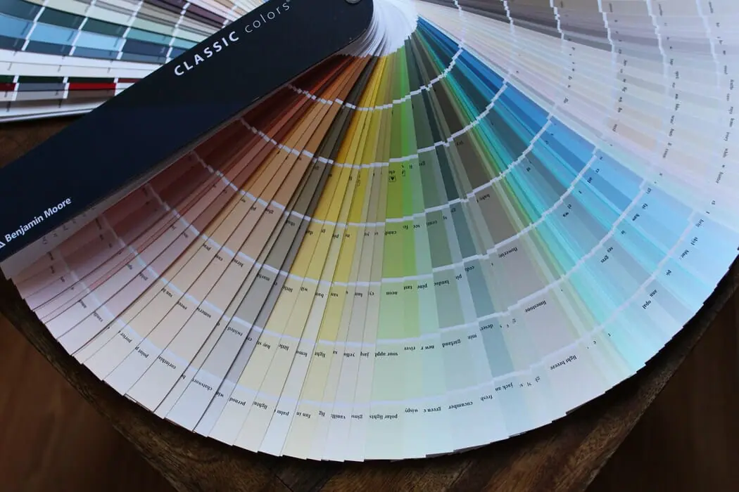
When it comes to designing your home, choosing the right color scheme is essential for creating a harmonious and visually appealing space. One popular rule that designers often follow is the 60-30-10 rule. This rule suggests allocating 60% of the room’s color to a dominant color, 30% to a secondary color, and the remaining 10% to an accent color. This balance ensures that the colors in your space work together cohesively and create a pleasing aesthetic. The dominant color sets the overall tone and can be used for larger elements like walls and furniture. The secondary color complements the dominant color and can be featured in items like curtains and rugs. Finally, the accent color adds pops of visual interest and can be incorporated through accessories like throw pillows or artwork. By following the 60-30-10 rule, you can achieve a well-balanced and visually striking color scheme in your home.
Dominant Color as the Base Color
In-home design, the concept of a dominant color as the base color plays a crucial role in setting the tone and creating a cohesive overall color scheme. The dominant color serves as the foundation upon which the rest of the colors in the space are built.
Choosing the right dominant color requires careful consideration of the mood and atmosphere you want to create in each area of your home. For example, in a living room, you may opt for a warm and inviting color like a deep shade of red or earthy brown, setting a cozy and welcoming tone. In contrast, a serene and peaceful bedroom may benefit from a dominant color in cool tones, such as a soft shade of blue or green.
Incorporating the dominant color effectively involves using it as the main hue for large surfaces like walls or flooring. This establishes a harmonious backdrop that allows other colors to shine as accents. For instance, in a kitchen, you can use a neutral shade like gray or beige as the dominant color on the walls and cabinets, and then add pops of color through accessories like throw pillows or artwork.
By understanding the significance of the dominant color as the base color, you can ensure that your home design has a well-balanced and cohesive look. It serves as the driving force behind the overall color scheme, setting the tone and mood for each space in your home. So, pay attention to this foundational element and enjoy the beauty it brings to your living spaces.
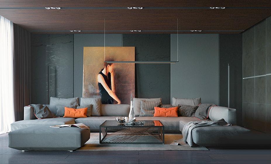
Complementary and Contrasting Colors
Complementary and contrasting colors play a crucial role in interior design, adding depth and visual interest to a space. These color schemes create a visually appealing and harmonious environment by incorporating colors that are opposite or contrasting on the color wheel.
Complementary colors are pairs of colors that are found opposite each other on the color wheel. When used together, they create a vibrant and lively look. For example, pairing blue with orange or green with red can create a striking visual impact.
On the other hand, contrasting colors are those that are placed near each other on the color wheel but have contrasting properties. These combinations create a strong visual contrast, making elements stand out and adding a dynamic touch to the space. For instance, combining a warm color like yellow with a cool color like violet can create a visually stunning effect.
Balancing these vibrant color schemes with neutral colors is equally essential. Neutral colors act as a soothing backdrop that prevents the space from becoming overwhelming. They provide a visual resting place for the eyes and allow the complementary or contrasting colors to shine without overpowering the overall design. Using neutral colors as a base can also provide flexibility and versatility, as they work well with a variety of color palettes and styles.
Incorporating complementary and contrasting colors, along with the right balance of neutral colors, can elevate the design of any space and create a visually appealing and harmonious ambiance.
Natural Light and Its Effects on Color Choice
Natural light plays a crucial role in the overall design of a home and can greatly impact color choices. The amount and quality of natural light that enters a space can significantly affect how colors appear. Sunlight can vary throughout the day, ranging from warm and golden tones in the morning to cooler, bluer hues in the afternoon. Considering the direction and intensity of natural light can help in determining the right colors for a room. For example, if a room receives ample natural light, it can handle darker colors without feeling too enclosed. On the other hand, if a space lacks natural light, choosing lighter colors can help create the illusion of a brighter and more open area. Natural light can also enhance the vibrancy of colors, making them appear more vivid and saturated. Therefore, it is important to take into account the effects of natural light when making color choices to ensure the desired ambiance and atmosphere in a home.
Creating a Personalized Color Palette for Your Home Design
Creating a personalized color palette for your home design is an important step in creating a cohesive and harmonious space. By incorporating key principles such as choosing a white, a neutral, and one main color, and then selecting additional colors based on a color wheel scheme, you can create a space that reflects your style and desired atmosphere.
Start by selecting a white shade that will serve as a base color for your home. White provides a clean and fresh backdrop that allows other colors to shine. Next, choose a neutral color that will add depth and balance to your palette. Neutrals such as beige, gray, or taupe work well as they can complement a variety of other colors.
The main color should be the focal point of your palette. Consider the emotions and feelings associated with different colors. For example, warm colors like red or orange can create a cozy and inviting atmosphere, while cool colors like blue or green can promote a sense of calm and relaxation.
Once you have your base colors, you can select additional colors based on a color wheel scheme. Monochromatic schemes involve using shades and tones of a single color to create a harmonious and balanced look. Split-complementary schemes involve using a main color and two colors adjacent to its complementary color for a more subtle and balanced effect. Analogous schemes involve using colors that are next to each other on the color wheel for a harmonious and cohesive look.
By considering the psychology of colors and selecting a personalized color palette, you can create a home design that reflects your style and evokes the desired emotions and atmosphere in each space.
Conclusion
In conclusion, the importance of color in home design goes beyond aesthetics. It has the power to influence our mood, enhance the ambiance, and create a space that feels true to our personality. So, take the time to explore different color palettes, experiment with various combinations, and create a home that truly reflects who you are.